Are degree standards the same at all universities?
This guest blog has been kindly written for us by Dr Andrew Hindmarsh, who is an analyst for the Complete University Guide and also Head of Planning at the University of Nottingham. Any views expressed in this article are those of the Complete University Guide and do not necessarily reflect those of the University of Nottingham.
University standards have been in the news quite a bit recently, largely as a result of so-called ‘grade inflation’. The proportion of students getting good degrees has been going up and some commentators have been accusing universities of changing their standards. Universities are supposed all to have the same standards, of course, with the external examiner system being a key component of maintaining that position. But is that really the case? Do all universities actually all award degrees with the same standards?
This is a question that interests us at the Complete University Guide because we provide advice and guidance to potential students about the university experience and, whether you see high standards as a good thing (the degree is worth more) or a bad thing (it is harder to get a good one), it is clearly a relevant piece of information.
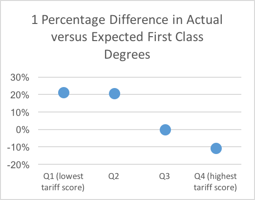
In that context, we decided to have a look at the data and see what it said about standards (see the section at the end of this article for details of what we did). The results were striking: the difference between the actual number of first class degrees awarded and the expected number based on the subject mix and entry standards of the university differed markedly between institutions, varying from over 30% fewer than expected to nearly 70% more than expected. Even more striking was what happened when we plotted this difference against the average tariff score of the students. The result was a strong negative correlation – the higher the tariff score of the students at the institution, the fewer the first class degrees awarded compared with the expected number (r=-0.502, p<0.001). This effect can be demonstrated most starkly by dividing institutions into quartiles for the average tariff score and plotting the percentage difference between the actual and expected number of first class degrees.
The graph below clearly shows that students at universities with high tariff scores (Q4) are much less likely to get a first class degree than expected when you allow for the tariff score and subject studied of those students. In contrast, students at universities with a low tariff score (Q1 and Q2) are much more likely to get a first class degree than you would expect. Students at universities in the third quartile (Q3) get about the expected number of first class degrees.

To illustrate this with an example, a student with 300 points from three A-Levels (BBB or equivalent) studying biological sciences had (in our dataset) a probability of obtaining a first class degree of 0.06 at a university with an average entry standard of 338 points from 3 A-Levels compared with 0.35 at a university with an average of 247. The probability for all universities was 0.23.
If you look at First and 2:1 degrees together in the same way, you get the same pattern but the differentials are smaller, with Quartile 1 and 2 institutions awarding 2-3% more First/2:1 degrees than expected and Quartile 4 institutions awarding 1.5% fewer.
So what is going on? One explanation is that some universities are much better at teaching than others and that is why they award more first class degrees than expected. That may well be true but can it explain these results? It would be rather surprising if the quality of teaching relentlessly declined precisely in line with the increasing quality of the students.
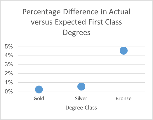
If we repeat the analysis according to the Teaching Excellence and Student Outcomes Framework (TEF) awards, then we find that Bronze institutions are in fact awarding more first class degrees (about 5%) than expected, while Silver and Gold institutions award about the same number as expected (see graph below). All groups award about the same number of First/2:1 degrees as expected. So, if the TEF is measuring anything to do with teaching quality, it suggests that it is not teaching quality that is causing the differences in the award of degrees.
Another explanation is that universities have different standards and that, in general, those which recruit the highest performing students have the highest standards. This difference is most marked at the First/2:1 boundary but is also present, though smaller, at the 2:1/2:2 boundary. This would fit with the popular perception that the universities that recruit good students also have higher standards. The fact that it is popular perception does not make it wrong.
How we did the analysis:
We obtained a dataset from the Higher Education Statistics Agency (HESA) consisting of the numbers of students in each subject at each university, their degree classification and their tariff points from their best three A-Levels over the last five years. Subject and tariff points are both known to be strongly associated with degree class. We excluded Scottish universities (where the proportion of students with A-Levels is much lower), graduates in Medicine and Veterinary Science (where the approach to classification is often very different), and unclassified degrees to reduce the amount of spurious variance.
We then calculated the probability of a student in a given subject with a given number of A-Level points getting a given class of degree and repeated that for all combinations of subject and A-Level points. These probabilities can then be used to calculate an expected number of students at a particular university getting a given class of degree. This is essentially the same methodology as used to calculate benchmarks in the TEF metrics and the HESA performance indicators. This expected number can then be compared with the actual number at that university.
A more detailed study might take account of other factors such as gender, ethnicity, type of school attended, etc, but the impact of these other variables would have to be very large in order to make a substantial difference to the conclusions of this simpler study.


Comments
John Davies says:
How about a table of universities based on the average mark required to get a first class degree? This was 70% in the distant past but I suspect that few universities have stuck rigidly to this threshold. I have heard of some universities that base classification on only the best 75% of credits, in which case it might be possible to get a first with an average mark of only 52.5%. Unfortunately some universities have such complicated regulations for classification that it may not be possible to devise a simple number like this.
Reply
Steven Jones says:
Surely this analysis makes the Complete University Guide think “hold on, we need to stop using ‘good honours’ as an indicator in our league tables”?
At best, the data doesn’t make for equitable cross-institution comparison.
At worst, it actively rewards grade inflation.
Reply
Lesley Lant says:
I originally graduated in 1983 with a 2:2 in Mathematics from the University of Sheffield.How does my standard correspond to today’s ?
Reply
Add comment