Who influences UK higher education policy?
This is a guest post kindly contributed by Louis Coiffait, Head of Policy at London Metropolitan University. He writes here in a personal capacity. HEPI had no role in the placement of organisations on the graphs below.
It’s a common question, but one that’s tricky to answer. Here are two attempts to do so using simple graphics. I’ve listed the organisations that I think are influential and plotted them on some basic axes. The list and their position is purely a subjective (albeit somewhat informed) judgement call. Available space and logo size/shape may sometimes play a role here too. This is not a serious, quantified, metric-fuelled exercise. It’s a bit of fun, with the intention of informing and sparking debate.
Additional axes/metrics could include transparency about funding/purpose, scale of resources, degree of ‘evidence strength’, or years established.
The approach is based on one, two, three, four blogs I’ve done with Ross McGill a.k.a. @TeacherToolkit (the most-followed teacher on Twitter).
Please feel free to say where you think an organisation should be placed differently (and importantly, why). Constructive feedback is very welcome.
Think tanks
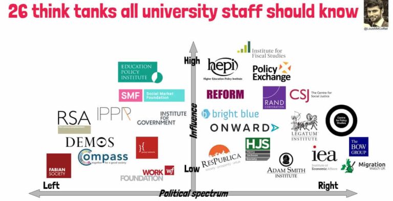
The definition I’m using here is the one from the previous iterations i.e. the organisation calls itself a think tank, it’s not part of government or the press, and it’s primary purpose is to influence policy (including [but not necessarily exclusively] HE policy in England). I’ve not included my former employer Wonkhe as I think they primarily count as press, so no THES, Research Fortnight or mainstream press either. Feel free to quibble at will with this.
Other organisations that influence HE policy
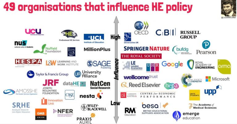
Again, the definition I’m using follows previous iterations i.e. the organisation does not calls itself a think tank, is not part of government or the press, and may well have other priorities – but influences policy (including HE policy) in England all the same. Again, definitional quibbles welcome. The ‘left-right’ political spectrum doesn’t apply to this chart.
So there you have it, a bit of logo tessellation from someone who’s spent a fair bit of time thinking about such things – hopefully of some use, constructive feedback welcome.


Comments
albert wright says:
An interesting, colourful and visual approach to the topic.
Who do you think has the most impact on policy?
Reply
Dominic Foster says:
Thanks – informative and debatable! It would be a great addition to see direction of travel.
Reply
Add comment