Benchmarking widening participation: how should we measure and report progress?
In this new Policy Note, Professor Iain Martin, Vice Chancellor at Anglia Ruskin University, looks at each university’s success in widening participation and ensuring access to people from all backgrounds.
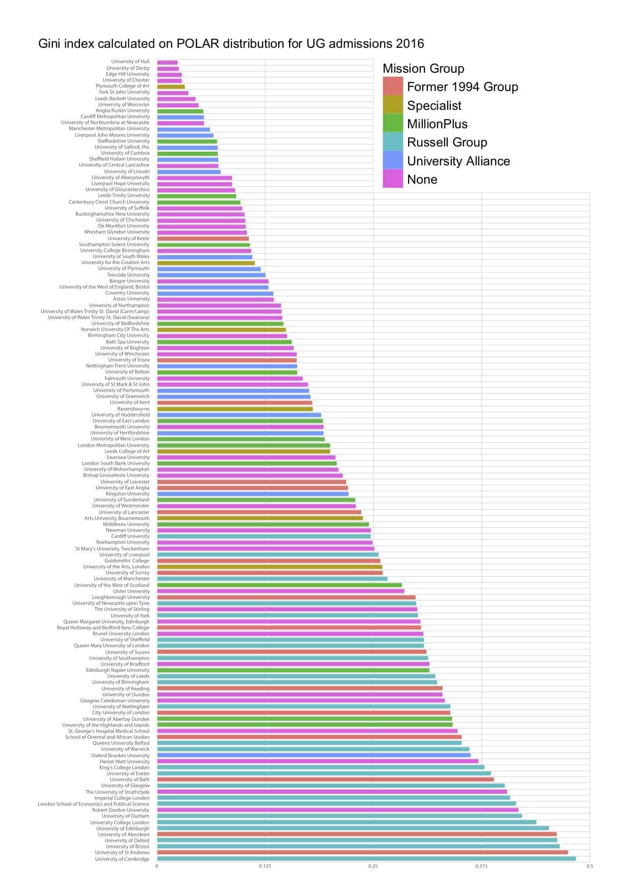
Professor Martin proposes a new measure of equity in participation, which demonstrates graphically the most equal – and most unequal – HE institutions in the UK.


Comments
Julio says:
Your report notes that:
The best measure on equity of participation in the UK is the POLAR (Participation of Local Areas) system.
This is not true. As you will note from the HESA website, this measure is not appropriate for Scotland:
The POLAR low participation measure is based on a UK wide classification of areas into participation bands. The relatively high (in UK terms) participation rate in Scotland coupled with the very high proportion of HE that occurs in FE colleges means that the figures for Scottish HE providers could, when viewed in isolation, misrepresent their contribution to widening participation. Therefore, low participation data has not been produced within the UK Performance Indicators for HE providers in Scotland from 2007/08.
The Scottish Funding Council (SFC) produce their own indicators relating to young full-time Scottish domiciled undergraduate entrants, showing proportions from the most deprived datazones and also from social classes NS-SEC 4-7. These measures are produced and published independently of ‘UK Performance Indicators in HE in the UK’.
.Again, another piece of shoddy analysis that ignores variation in the devolved nations.
Reply
Replies
Nick Hillman says:
Thanks for this feedback. Given the devolved nature of much higher education policy, it is always a tricky decision whether to look at each part of the UK independently or whether to try and conduct UK-wide comparisons on a like-for-like basis, despite the challenges in doing so fairly. The feedback we receive suggests some people will be unhappy whichever option we choose. Therefore, we try to present a mixture of approaches. Some of our reports are UK-wide (such as our recent report on the costs and benefits of international students or our 2017 report on the impact of Brexit on demand for higher education), others cover the whole UK but consider each part separately (such as our recent report on differential fees or our 2017 report on cross-subsidies from teaching to research) and others concentrate on just one part of the UK (like our recent report on future demand for higher education in England or our submission to the Diamond review in Wales). We will go on striving to ensure we give fair coverage to each part of the UK, even though this becomes harder over time as the different systems in place in the four parts of the UK continue to diverge.
Reply
Michael O'Neill says:
Am I able to get the numbers behind the graph? I can’t find them anywhere on the website. Thank you.
Reply
Add comment