The hard truth about grade inflation: Testing some hypotheses
This guest blog has been kindly provided by Dr Andrew Hindmarsh, Head of Planning at the University of Nottingham. His responsibilities include providing management information and statistical returns to official bodies. Previously, he was Head of the Undergraduate Admissions Office at the University of Sheffield. He is also the Chair of the Board of a multi-academy trust in the East Midlands.
He oversees the preparation of data for the Complete University Guide tables and any views expressed in this article are those of the Complete University Guide and do not necessarily reflect those of the University of Nottingham.
Accusing universities of ‘grade inflation’ has become a common pastime in political and media circles. What they mean is that the proportions of good degrees awarded have been going up, but it is referred to as grade inflation so that the preferred explanation (ie university perfidy) is built into the term that is used to describe the phenomenon.
However, degree classifications could be changing for a whole of host of reasons, and at the Complete University Guide we decided to test some of them using a dataset of degree classifications we had obtained from the Higher Education Statistics Agency (HESA).
Number of ‘good’ degrees
First, the dataset confirmed that the proportion of graduates obtaining a first-class degree had risen by 10 percentage points in the period 2012/13 to 2016/17. The proportion of graduates obtaining either a First or an Upper Second rose by 7 percentage points. (NB The dataset is slightly restricted, so the figures for the whole graduating population might be slightly different – see note at end.)
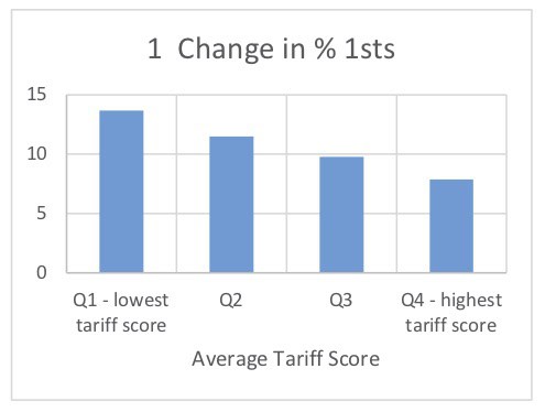
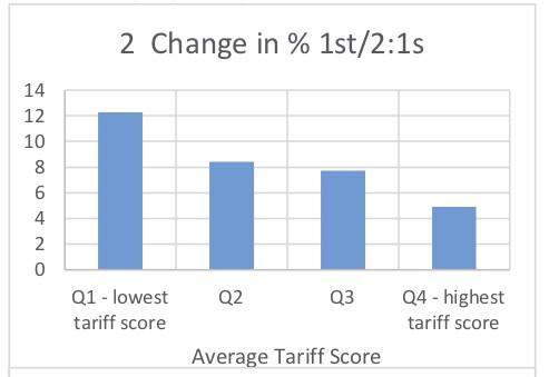
High tariff versus low tariff
However, the changes are very different at different institutions with the biggest increases being 28 percentage points for Firsts and 24 percentage points for Firsts and Upper Seconds. These are very big changes. In order to understand more about what is going on, we plotted the change in the proportion of Firsts against the average tariff score of the students for all the universities in the dataset.
This resulted in a negative relationship for both Firsts (r=-0.42, p<0.001) and First and Upper Seconds (r=-0.46, p<0.001). Graphs 1 and 2 aggregate institutions according to the quartile of the average tariff score and this makes the relationship very clear: the change in degrees awarded has been smaller the higher the average tariff score of the university. So-called grade inflation has been greatest at universities with low average tariff scores and least at those with high average tariff scores.
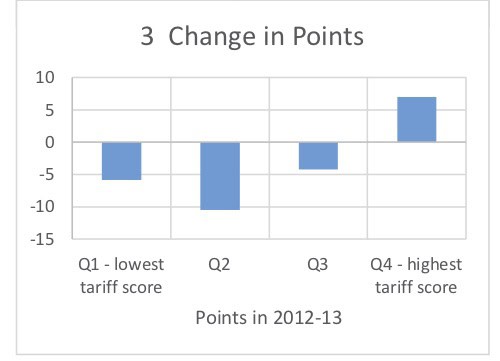
One explanation for this could be that the average tariff score has increased more at universities where the average score was lower to start with. If those low tariff score universities had had entry standards that had been rising faster, then you might expect there to be an impact on the subsequent attainment of the students. Graph 3 shows that this has not been the case. In fact, the average triff score of universities in quartiles 1 to 3 have all gone down, while only those in quartile 4 (the highest) have gone up.
So it does not look as though rising entry standards can explain the changes in degree classifications.
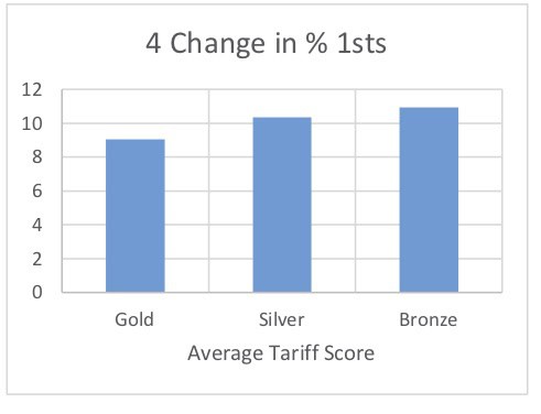
Teaching quality
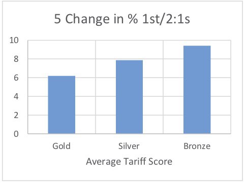
What about teaching quality – could that explain the pattern of changes? Could it be that the universities with the best teaching quality have seen outcomes improve the most? One possible measure of teaching quality is the TEF (Teaching Excellence Framework) outcomes. Graphs 4 and 5 show the change in degree outcomes according to the TEF outcome and the hypothesis fails – it is the Bronze institutions which have seen the biggest changes in degree outcomes.
The questions on teaching in the NSS could be an alternative measure of teaching quality and this time there is a run of data so the change in NSS scores can be correlated with the changes in degree classification. However, once again the hypothesis fails: there is no correlation between the change in NSS scores on questions 1 to 4 between 2013 and 2016 and the change in degree classifciations (either 1sts or 1st/2:1s, r ≈ -0.1, p > 0.1).
Conclusion
So what is going on? There are plenty of hypotheses left which our database cannot test. One change that has been happening is an increasing use of the full range of marks, particularly in Arts subjects. In the past, there was a tendency to avoid giving high marks with those above 80 in the Arts being very rare indeed. These high marks are much more common in the Sciences, particularly the numerical sciences, where it is possible to achieve maximum marks on mathematical problems. However, many universities are now actively encouraging all subjects to use the full range of marks with the result that, when an average mark is calculated, this is more likely to fall above a particular class boundary as the higher marks pull up the average. This hypothesis also explains why the proportion of first-class degrees has risen faster than the proportion of 1st/2:1s as you would expect more of the high marks to be obtained by students already at or close to a first-class standard.
The conclusion must be that this is a complex subject and, while some explanations for changes in degree classifications can be ruled out, there are plenty more to be considered. The accusation that grade inflation is the cause needs to be justified with evidence rather than simply asserted as if it were a self-evident truth.
| How we did the analysis We obtained a dataset from HESA consisting of the numbers of students in each subject at each university, their degree classification and their tariff points from their best three A levels over the last five years (2012/13 to 2016/17). Subject and tariff points are both known to be strongly associated with degree class. We excluded Scottish universities because the proportion of students with A-Levels is much lower, graduates in medicine and veterinary science where the approach to classification is often very different and unclassified degrees to reduce the amount of spurious variance. We then calculated the proportion of students obtaining each class of degree in each year and used this to test various hypotheses as to why the proportions were changing. |
Comments
John Davies says:
If there really is “an increasing use of the full range of marks” I would expect an increase in the number of first and third class degrees at the expense of the second classes because “the full range” implies greater use of low marks as well as high marks. This is not consistent with the evidence so I do not believe that this can be the explanation either.
Reply
Replies
Andrew Hindmarsh says:
If, in practice, it is the upper end of the mark range that causes concern in institutions and that is where behaviour change is focussed, then the proportion of firsts will be disproportionately affected.
Reply
Neville Cawas Bardoliwalla OBE says:
The hard truth to swallow about grade inflation is it’s actually happening.
Reply
Add comment